
Claude Design to revamp two projects
... can AI do webdesign now?
Design has always been my bottleneck. I usually have a fairly clear idea of what I want, but turning that into a consistent interface is where I get stuck. For the last redesign of my resume site, back in 2024, I ended up hiring a designer through Fiverr to get unstuck. So when Anthropic released Claude Design, a web-based tool that turns screenshots and Figma files into editable prototypes, I was genuinely curious whether it could close that gap.
To put it through its paces, I used it to redesign two projects: a small Svelte app I use as a testing ground, and the resume site I just mentioned.
The interface itself is straightforward: upload screenshots, write a prompt, and iterate by commenting on specific elements or drawing directly on the layout. It can produce low-fidelity wireframes or high-fidelity, browser-ready mockups you can click through. Changes are applied in place, so it feels much more like a live design tool than a chat window with a preview pane.
Modernising a Svelte-based web interface
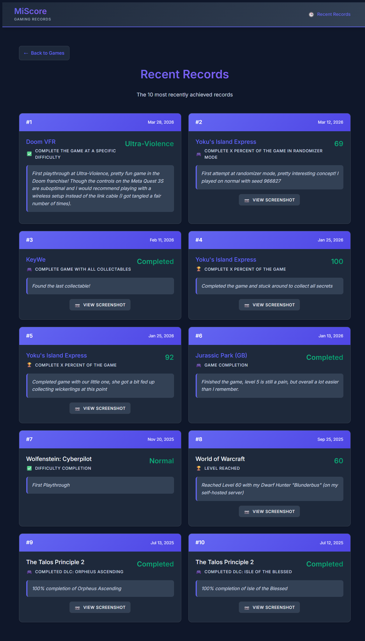
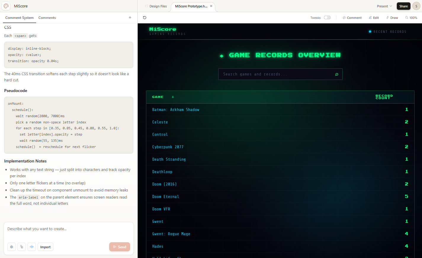
For a while now I’ve been working on a small set of tools to track video game records: a Python package that validates game data using Pydantic which contains a CLI to manage those JSON records, a Svelte-based frontend that turns the data into a static site, and a separate repo holding my own data. I call this project MiScore. It also doubles as my playground for experimenting with Pydantic, Click, Svelte, and whatever else I feel like trying. The current version of my site lives at sebastian.proost.science/MiScore-site/.
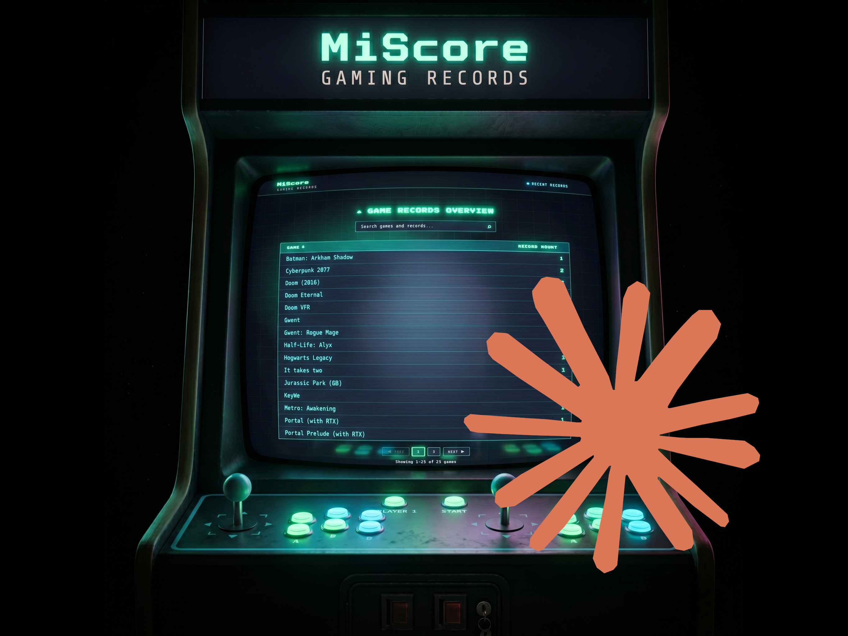
The original design came together with Claude Code, and I was reasonably happy with it. But over time I noticed the model kept falling back on the same visual patterns, and what started out fresh began to look like the generic “vibe-coded” layout you see everywhere. A good excuse for a redesign.
I captured screenshots of the existing pages to pin down the structure and content, uploaded them to Claude Design with a short prompt describing MiScore, and after a few clarifying questions about style and colors it produced an initial high-fidelity prototype.
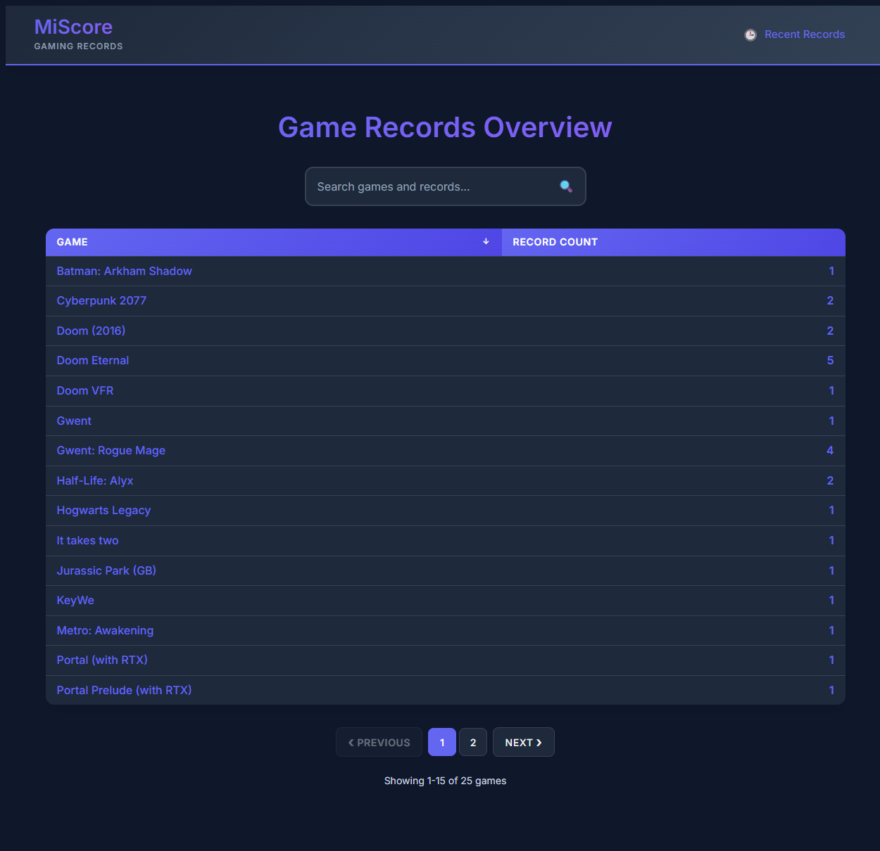
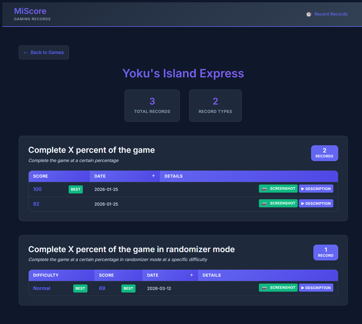
I asked for a retro game aesthetic: dark theme, green highlights, subtle CRT and neon touches. The first pass was close, but a few colors felt off and the whole thing looked a bit static. The comment tools were really useful here, you select a specific element and tell it what to change, rather than trying to describe it in a prompt. A couple of iterations in, I had the mood I wanted, with a subtle background animation and a flickering neon-style title to tie it together.
For the handoff, Claude Design produced a zip with a self-contained HTML prototype and a markdown file of implementation notes aimed at Claude Code. I dropped it into the MiScore-site repo under a redesign folder, opened Claude Code with Opus 4.7, and asked it to integrate the new layout into the existing Svelte project, following Svelte conventions rather than copying the prototype verbatim. It handled the structural changes cleanly, used Svelte’s reactive features where appropriate, and the result needed no manual correction. I’m not experienced enough with Svelte to audit every line and evaluate the overall quality, but the code was readable and maintainable, which is what I care about.
The whole redesign took a single evening, and I didn’t hit usage limits on the Pro plan for either Claude Design or Claude Code.
Updating my resume
If you want to know what I’ve been up to professionally, my resume site is at sebastian.proost.science. I keep it reasonably up to date, mostly by adding new content, and occasionally I revisit the design. As I mentioned, the 2024 redesign was partly done by a Fiverr designer, which worked but never felt entirely consistent.
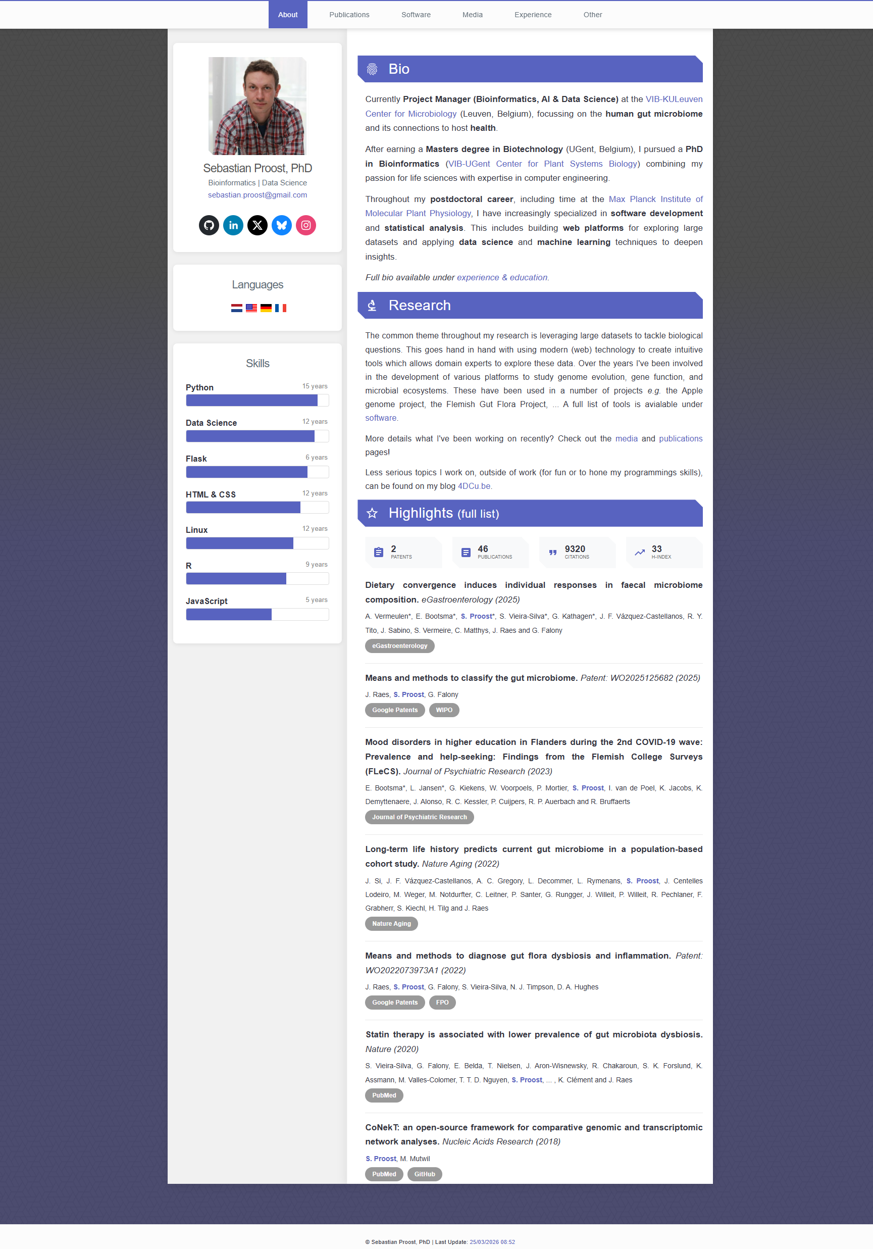
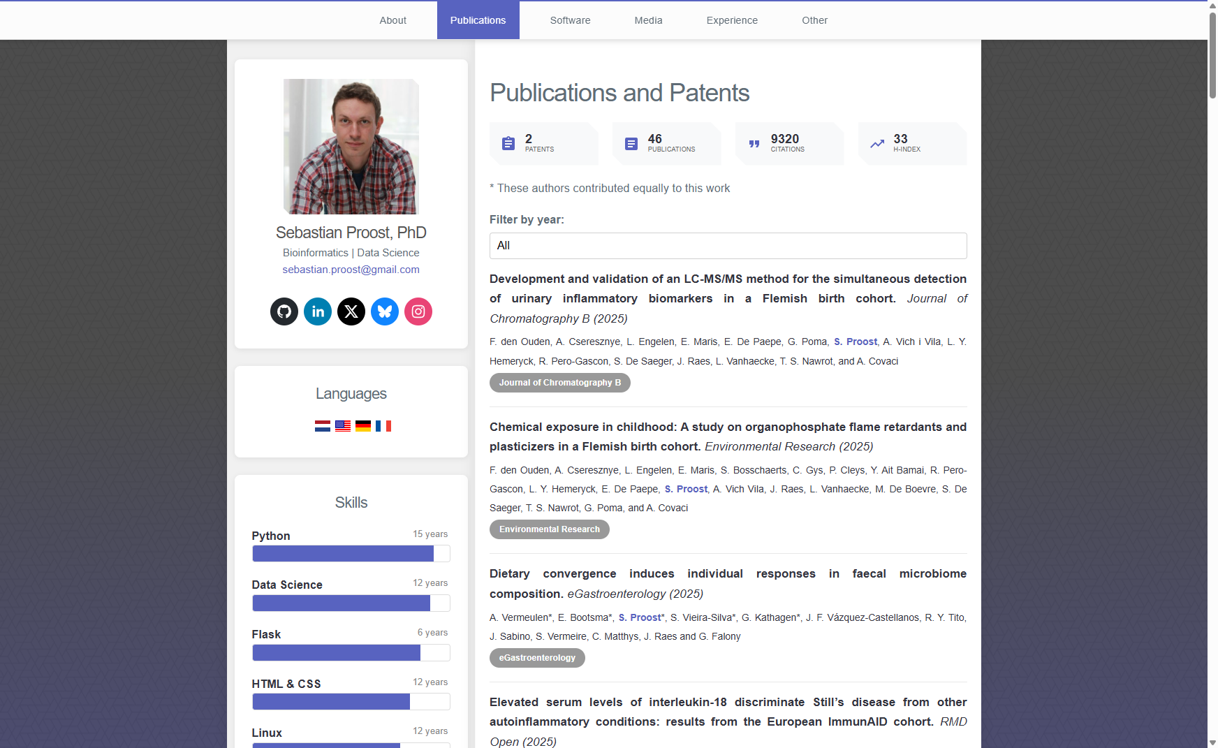
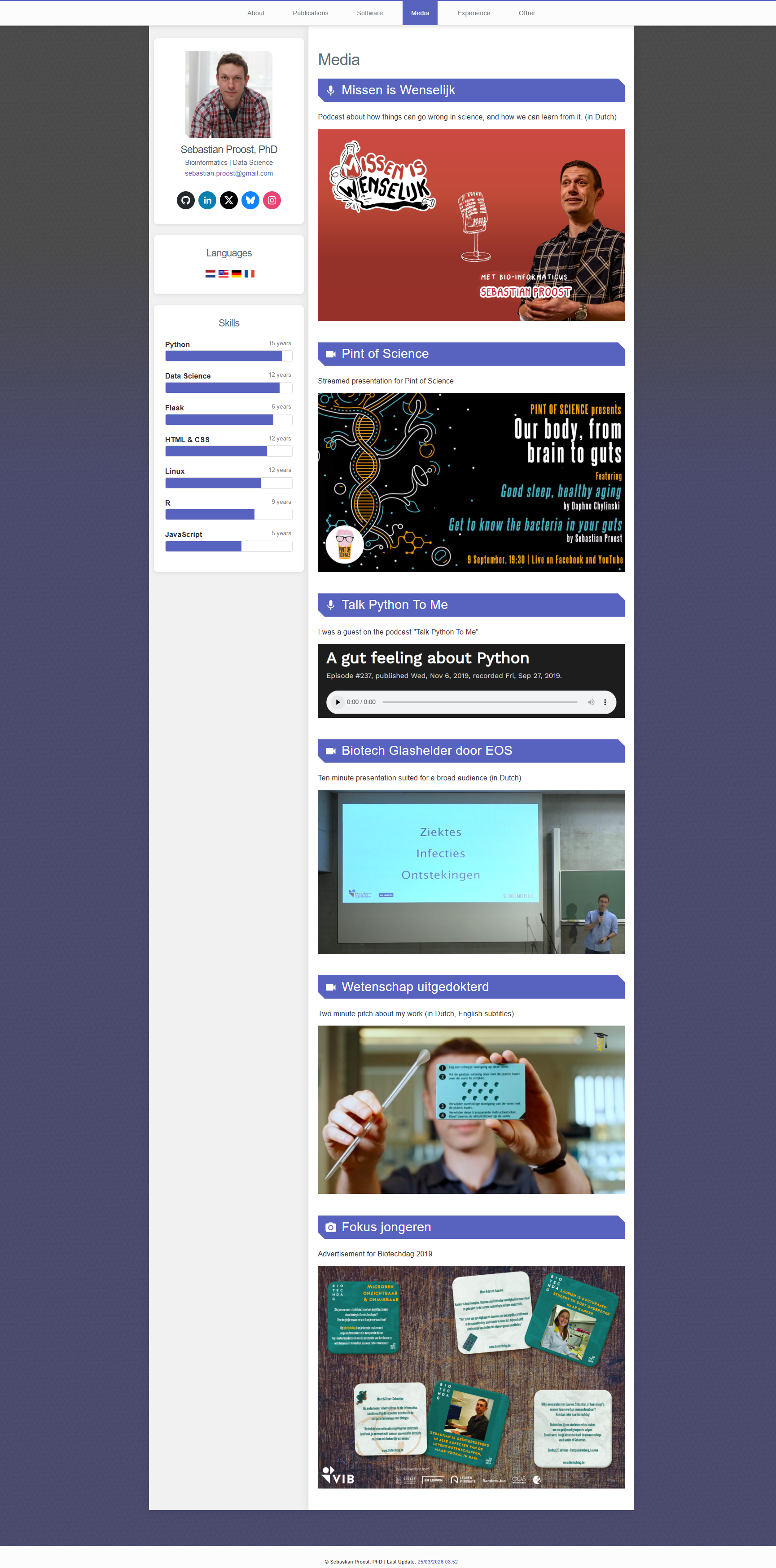
This time I uploaded screenshots to Claude Design, asked for a refresh, answered a few questions about colors and style, and it generated a prototype in teal and cyan with plenty of whitespace.
The result was clean, but the hero banner felt flat. I asked for a JavaScript-based animation: a dynamic network graph with nodes moving and connecting using simple physics. It worked on the first try, though the nodes kept drifting into a tight cluster in the center. Adding a periodic “explosion” that pushed them outward solved that and made the whole thing feel more alive. Under the hood it’s a small force-directed system on a 2D canvas: springs, repulsion, damping, and a nudge every few seconds to keep things organic. You can see it running below.
After a few smaller tweaks using comments, I generated the handoff and dropped it into the project repo.
Unlike MiScore, this site was built with Gatsby, and it had accumulated a fair amount of technical debt: outdated dependencies, slow builds, and a generally unpleasant developer experience. My plan was to integrate the redesign into the existing setup, but Claude Code (Opus 4.7) didn’t manage to produce a working build using a full session worth of tokens.
That turned out to be a blessing in disguise. Gatsby wasn’t really a requirement anymore; it just happened to be what I picked last time. The only real constraint was that the site had to stay static and easy to host on GitHub Pages. So I took a step back, looked at Astro, Eleventy, and Hugo, and landed on Eleventy for its simplicity and how well it handles YAML data.
I started from scratch: new repo, copied over the content (publications, work experience, and more, all stored as YAML), added the design handoff, and set up a devcontainer with VS Code and Docker. Claude Code turned the prototype into a working Eleventy site in minutes. The layout matched the design, the interactive bits were implemented in vanilla JavaScript, and the YAML data was wired in cleanly.
A few gaps remained. Navigation triggered full page reloads, whereas the Gatsby version felt like a single-page app. I asked Claude Code to add a lightweight client-side navigation layer, which worked with surprisingly little code, though it broke a few things like filters and “show more” buttons that needed to be re-initialised after navigation. Easy fixes once I spotted them. A few responsive and mobile tweaks rounded it out.
The whole thing took less than a day. The failed Gatsby integration ate the morning; the Eleventy rebuild, tweaks, and deploy fit into the afternoon. I ended up with a better design and a simpler codebase, which rarely happens in the same redesign.
Conclusion
Having a visual interface to build a UI, and being able to guide changes by pointing at them and describing in plain English what you want, is a real step forward. I was already happy with what Claude Code could do, but this adds a layer that makes iteration feel closer to working with a designer than engineering. Ideas can get tested faster, which changes how I make design decisions. You can quickly try things that wouldn’t be worth the effort otherwise.
The one thing I’m unsure about is diversity. In these two projects the output was great, better than what I’d produce on my own. But as more people start using these tools, I wonder if we’ll start noticing the same aesthetic showing up everywhere, the way “vibe-coded” layouts already do. Something to keep an eye on.
There’s also a more uncomfortable shift. In 2024 I hired a designer to get this site where I wanted it. This time I didn’t need to, and I don’t think I will for small or medium-sized personal projects going forward. That’s empowering on my end, but it also shifts work away from people who used to provide that creative input as a service.
For me, the net effect is that I’ll keep using this workflow. Not as a replacement for thinking about design, but as a way to move from idea to prototype fast enough that the design thinking actually gets done, instead of being endlessly deferred.
Liked this post ? You can buy me a coffee