
Putting Benford's Law to the Test
numbers might not be as random as you think
After seeing the Episode on Benford’s Law in Latif Nasser’s Connected (currently on Netflix), I had to test if this is true and if I could find a few datasets where it applies. And … I did! But before we get into details, let’s first explain what Benford’s Law is.
Benford’s Law states that the leading digit (that is the first digit in a number, also called the most significant digit) in a lot of collections of numbers is not randomly distributed. The first digit will most frequently be 1 (in about 30% of the numbers as opposed to 11% if it were truly random), the next most frequent digit will be two, … and the least frequent will be 9 ( which would be the first digit far less frequent than you would expect). With other numbers decreasing in probability according to a log scale.
The probabilities for each digit he proposed would fit this formula, P(n)=log10(1+1/n), and with a little python code we can quickly compute these and plot them out.
import pandas as pd
import numpy as np
import seaborn as sns
palette = sns.color_palette("GnBu_r", 9)
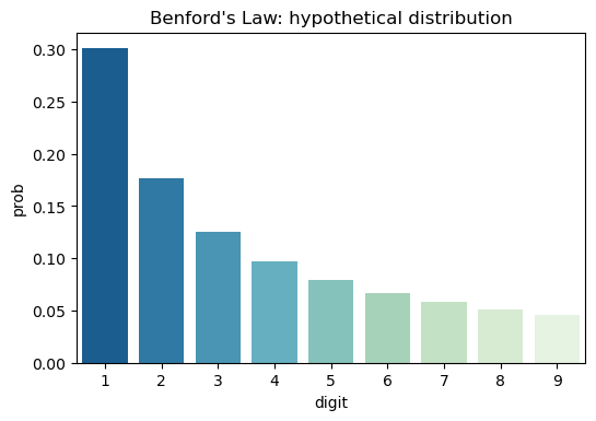
benford_proba = ({'digit': i, 'prob': np.log10(1+1/i)} for i in range(1,10,1))
ideal_df = pd.DataFrame(benford_proba)
sns.barplot(x='digit', y='prob', data=ideal_df, palette=palette).set_title('Benford\'s Law: hypothetical distribution')
plt.show()
Here a generator comprehension is used that will yield all probabilities for digits 1 through 9, convert it into a Pandas dataframe and plot everything with Seaborn. You can see the hypothetical distribution here:
Now let’s get some datasets and check if they match or not!
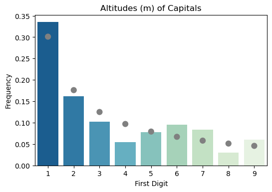
The Altitudes of Capitals
On WikiPedia you an find a list of all United Nations Countries, with their capital and how many meters above sea-level those cities are located at. This list was converted into an Excel spreadsheat, and loaded into Pandas dataframe. Now a little code was needed to filter out cities located at or below sea level, extract the most significant digit and then count these.
df = pd.read_excel('./data/capitals_altitude.xlsx')
df = df[df['Elevation (m)'] > 0]

df['first_digit_m'] = [str(n)[0] for n in df['Elevation (m)']]

counts_altitude_df = df.groupby('first_digit_m').agg(
    count = pd.NamedAgg('Country', 'count'),
).reset_index()
This resulted in a dataframe that looked like this :
| first_digit_m | count |
|---|---|
| 1 | 56 |
| 2 | 27 |
| 3 | 17 |
| 4 | 9 |
| 5 | 13 |
| 6 | 16 |
| 7 | 14 |
| 8 | 5 |
| 9 | 10 |
Indeed, number one occurs far more frequently than other digits. Though to make this more tangible, lets plot the frequencies with the hypothetical frequency according to Benford’s Law and use a test to check if they are significantly different or not. As there will be multiple datasets to test and plot, let’s put everything in one function:
import scipy.stats as stats

def plot_benford(x, y, data, title, ax=None):
    data = data.sort_values(x)
    benford_proba = (np.log10(1+1/i) for i in range(1,10,1))

    observed = list(data[y])
    expected = [round(prob*np.sum(data[y])) for prob in benford_proba]
    stat, p_value = stats.chisquare(f_obs=observed, f_exp=expected)

    if p_value > 0.05:
        palette = sns.color_palette("GnBu_r", 9)
    else:
        palette = sns.color_palette("OrRd_r", 9)

    frequencies = data[y]/np.sum(data[y])

    if ax is None:
        fig, ax = plt.subplots()

    sns.barplot(x=data[x], y=frequencies, palette=palette, ax=ax, zorder=0).set_title(title)
    sns.pointplot(x='digit', y='prob', data=ideal_df, ax=ax, zorder=1, join=False, color='gray')
    ax.set(xlabel='First Digit', ylabel='Frequency')
Parameters x and y are the column names for the column with the digits and the column with the counts respectively. Data is the dataframe with the count data and ax is optional and can be used to generate multi-panel images. The data will first be sorted, just to make sure the digits are ordered from 1 to 9 correctly and we’ll generate the probabilities here again. Next, the observed counts are stored in a separate variable and the expected count is calculated, this is the probability of each digit multiplied by the total number of observations. Using the chi-square test we can check if the distributions are the same (p-value > 0.05) or not and we’ll set the colors for our plot accordingly. Finally, the counts are converted into frequencies and everything is plotted. Colored bars for the observed data and gray dots indicating where Benford’s Law predicts they would be.
More datasets: COVID-19 infections, bacteria in the human gut and Gwent scores
So the altitudes of capital cities indeed seems to follow Benford’s Law. Time to grab some other datasets and see if Benford’s Law holds there. I picked Gwent MMR scores from the previous post, the number of daily COVID-19 infections in Belgian provinces, obtained from Sciensano and bacterial abundances in the human gut from the Human Microbiome Project.
You can find these datasets, the code to load them and process them on GitHub in the repository that goes along with this post here.
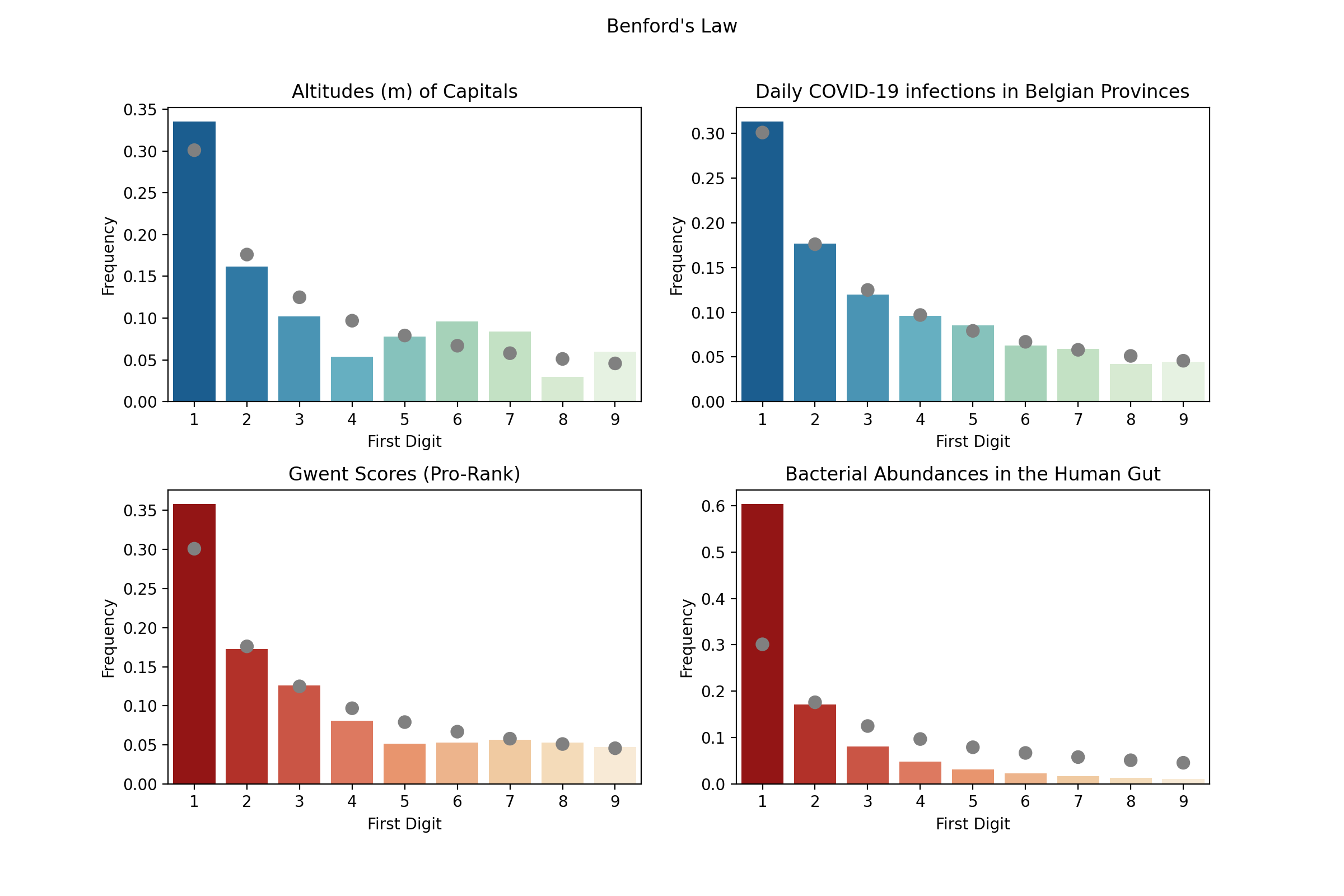
So the altitudes and COVID-19 infections follow Benford’s Law with statistical significant (or better they aren’t significantly different from Benford’s ideal distribution), hence these are plotted in shades of blue. For Gwent Pro Rank scores and (relative) abundances of bacteria in the human gut it is clear that the most significant digits aren’t uniformly distributed either, but the observed distributions do differ from Benford’s hypothetical ideal (hence shades of red are use for plotting these datasets). Though even if these differ from the idealized case, the distributions still fit a logarithmic decrease very well!
Conclusion
The fact that the first digits of seemingly random numbers don’t seem to be random at all is very counter intuitive at first. Numberphile offers a very good explanation why Benford applies on sets of numbers that follow an exponential growth. Check out their YouTube video here. While not all datasets adhere to an exponential curve, in a lot of cases going from 1 to 2 is easier than going from 2 to 3, … This would for instance be the case for Gwent scores (after subtracting the baseline score of 9600). As you are paired with better and better opponents as you get at higher MMR score, there are fewer people that can climb 200 points compared to 100 points. Therefore more players end up climbing 100 points than 200 and we start to see a shift in the frequencies of the first digits of the scores.
Similarly, the daily COVID-19 infections would go up exponentially when they would be left unchecked (and Benford’s Law would apply). However, while we take extensive measures to ensure the infection rate is curbed down (lockdown, social and physical distancing, mouth masks,…) it will become harder for the virus to spread and the curve will go down. But this is a slow process, and this curve has a very long tail, where the number of daily infections will go down from 30 to 20 faster than from 20 to 10 and this will also cause a non uniform distribution of first digits.
This episode of Connected was a head-scratcher and I don’t think I have ever spend this much time thinking about a single documentary (which is a good thing). Hopefully, Latif Nasser will have a chance to make a couple more seasons !
Liked this post ? You can buy me a coffee