Correlation Heatmaps with Significance in Python
using pandas, scipy and seaborn
While Pandas and Seaborn offer very quick ways to calculate correlations and show them in a heatmap. Whether those correlations are statistically significant or not is omitted from those plots. Over the years I’ve collected bits and pieces of code, like this, that turn out to be quite useful. Though them being scattered across a few dozen projects isn’t very convenient when I actually need them. So I’ll start to add some documentation and put them here with the tag Code Nugget, so they can easily be found by myself and others.
Normally you can use corr_df = df.corr() to get a correlation matrix for numerical columns in a Pandas data frame.
These in turn can be shown in a heatmap using sns.clustermap(corr_df, cmap="vlag", vmin=-1, vmax=1), leveraging
SeaBorn’s clustermap. Easy, though the significance of those correlations isn’t reported. To get those you can’t
rely on built-in functions and a bit more effort is required.
from sklearn.datasets import load_iris
from scipy.stats import spearmanr
import pandas as pd
import numpy as np
import seaborn as sns
import matplotlib.pyplot as plt
from statsmodels.stats.multitest import multipletests

iris_obj = load_iris()
iris_df = pd.DataFrame(iris_obj.data, columns=iris_obj.feature_names)


def get_correlations(df):
    df = df.dropna()._get_numeric_data()
    dfcols = pd.DataFrame(columns=df.columns)
    pvalues = dfcols.transpose().join(dfcols, how="outer")
    correlations = dfcols.transpose().join(dfcols, how="outer")
    for ix, r in enumerate(df.columns):
        for jx, c in enumerate(df.columns):
            sp = spearmanr(df[r], df[c])
            correlations[c][r] = sp[0]
            pvalues[c][r] = sp[1] if ix > jx else np.nan  # Only store values below the diagonal
    return correlations.astype("float"), pvalues.astype("float")


correlations, uncorrected_p_values = get_correlations(iris_df)

# Correct p-values for multiple testing and check significance (True if the corrected p-value < 0.05)
shape = uncorrected_p_values.values.shape
significant_matrix = multipletests(uncorrected_p_values.values.flatten())[0].reshape(
    shape
)

# Here we start plotting
g = sns.clustermap(correlations, cmap="vlag", vmin=-1, vmax=1)

# Here labels on the y-axis are rotated
for tick in g.ax_heatmap.get_yticklabels():
    tick.set_rotation(0)

# Here we add asterisks onto cells with signficant correlations
for i, ix in enumerate(g.dendrogram_row.reordered_ind):
    for j, jx in enumerate(g.dendrogram_row.reordered_ind):
        if i != j:
            text = g.ax_heatmap.text(
                j + 0.5,
                i + 0.5,
                "*" if significant_matrix[ix, jx] or significant_matrix[jx, ix] else "",
                ha="center",
                va="center",
                color="black",
            )
            text.set_fontsize(20)

# Save a high-res copy of the image to disk
plt.tight_layout()
plt.savefig("clustermap.png", dpi=200)
In this example we’ll load the iris dataset and convert it to a Pandas data frame, next a new function get_correlations
is defined that will return two new dataframes, one with the correlations (here spearman rank is used, see below) and
another one with the p-values for those correlations. Note we don’t store p-values for
combinations we don’t want to test (values on the diagonal) or don’t need to test (correlations are symmetrical, only
values below the diagonal are stored). Including these would make corrections for multiple testing unnecessarily harsh.
| sepal length (cm) | sepal width (cm) | petal length (cm) | petal width (cm) | |
|---|---|---|---|---|
| sepal length (cm) | 1.000000 | -0.166778 | 0.881898 | 0.834289 |
| sepal width (cm) | -0.166778 | 1.000000 | -0.309635 | -0.289032 |
| petal length (cm) | 0.881898 | -0.309635 | 1.000000 | 0.937667 |
| petal width (cm) | 0.834289 | -0.289032 | 0.937667 | 1.000000 |
While we have p-values for all those values, shown below, these are not corrected for multiple testing. The function
multipletests from the statsmodels package can correct these for us and report which ones are significant
(default cutoff <0.05), but the function requires a flat list of values. So we convert the matrix to a one-dimensional
array, apply the function and transform it back to the original shape using reshape.
| sepal length (cm) | sepal width (cm) | petal length (cm) | petal width (cm) | |
|---|---|---|---|---|
| sepal length (cm) | NaN | NaN | NaN | NaN |
| sepal width (cm) | 4.136799e-02 | NaN | NaN | NaN |
| petal length (cm) | 3.443087e-50 | 0.000115 | NaN | NaN |
| petal width (cm) | 4.189447e-40 | 0.000334 | 8.156597e-70 | NaN |
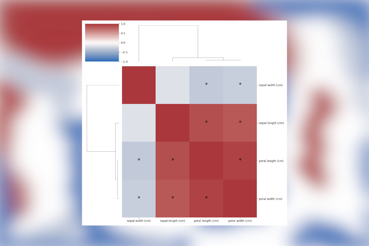
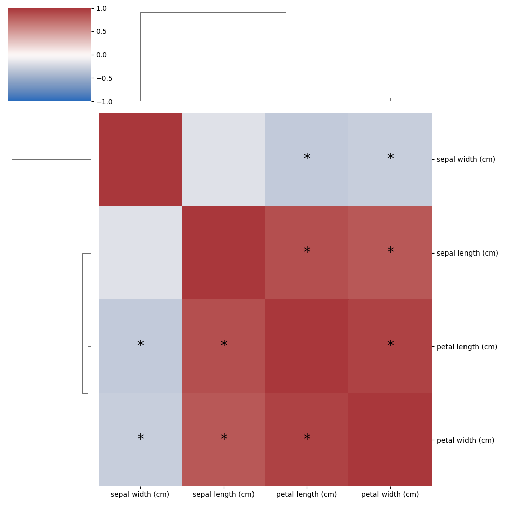
Finally, the correlations need to be drawn and the clustermap function is great here. Though we need a few
extra lines of code to put an asterisk in the cells which are significant. While it isn’t exactly rocket science how
this is done, it did require a fair bit of digging in the clustermap code to find exactly how to hook this in.
There are a ton of tweaks that could still be done here, but this will depend on your personal style and preference. The
hard part is done! Check out the result below!
Liked this post ? You can buy me a coffee