
PCA Plots with Loadings in Python
using pandas, sklearn and seaborn
Like the previous Code Nugget, this bit of code will add some often needed
features to PCA plots done with Python. Here the loadings and variance explained will be added to the plot, this is
something that is included by default in R’s biplot(), but in Python there is more too it. Like the last plot, the code
isn’t difficult, but to get it to work it does require a fair bit of digging in the documentation to find out how to
add this in.
First, the Iris dataset is loaded, some example data is required for these bits of code and as this dataset is readily available it is a very good choice. A few lines of code are added to turn the dataset into a Pandas dataframe.
from sklearn.datasets import load_iris
import pandas as pd
import seaborn as sns
import matplotlib.pyplot as plt


iris_obj = load_iris()
iris_df = pd.DataFrame(iris_obj.data, columns=iris_obj.feature_names)

iris_df["species"] = [iris_obj.target_names[s] for s in iris_obj.target]
iris_df.head()
| sepal length (cm) | sepal width (cm) | petal length (cm) | petal width (cm) | species | |
|---|---|---|---|---|---|
| 0 | 5.1 | 3.5 | 1.4 | 0.2 | setosa |
| 1 | 4.9 | 3.0 | 1.4 | 0.2 | setosa |
| 2 | 4.7 | 3.2 | 1.3 | 0.2 | setosa |
| 3 | 4.6 | 3.1 | 1.5 | 0.2 | setosa |
| 4 | 5.0 | 3.6 | 1.4 | 0.2 | setosa |
Next, scikit-learn is used to do a PCA on all the leaf measurements (so the species column is dropped). As prior to
running a PCA it is recommended to scale the data, a pipeline is used to apply the StandardScaler prior to the
PCA. While the pipeline isn’t strictly required here, for more complex analyses this is can save a lot of time and
potential mistakes, so I would recommend using it also for simple cases like this.
from sklearn.decomposition import PCA
from sklearn.preprocessing import StandardScaler
from sklearn.pipeline import Pipeline

pipeline = Pipeline([("scaler", StandardScaler()), ("pca", PCA(n_components=2)),])

pca_data = pd.DataFrame(
    pipeline.fit_transform(iris_df.drop(columns=["species"])),
    columns=["PC1", "PC2"],
    index=iris_df.index,
)
pca_data["species"] = iris_df["species"]

pca_step = pipeline.steps[1][1]
loadings = pd.DataFrame(
    pca_step.components_.T,
    columns=["PC1", "PC2"],
    index=iris_df.drop(columns=["species"]).columns,
)
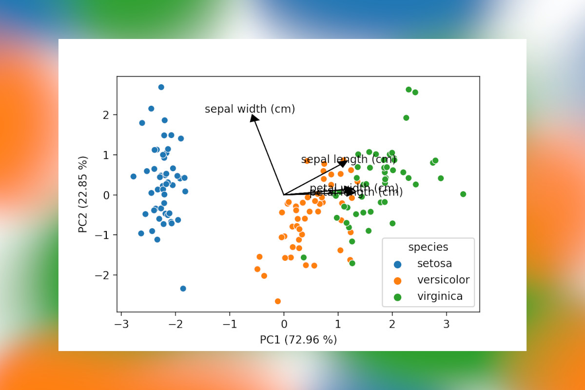
The last few lines are important here, this is the bit that gets the loadings for the different features and turns them into a dataframe shown below. Including these in a plot can help explain which features are driving the variation between groups of samples. So it is somewhat strange there are no off-the-shelve solutions to draw these in Python, at least to my knowledge, let me know in the comments if you know packages that do this! The code included below is based on a simple example I found here.
| PC1 | PC2 | |
|---|---|---|
| sepal length (cm) | 0.521066 | 0.377418 |
| sepal width (cm) | -0.269347 | 0.923296 |
| petal length (cm) | 0.580413 | 0.024492 |
| petal width (cm) | 0.564857 | 0.066942 |
The last bit of code will draw a scatter plot with the samples, add arrows for the loadings and also include the percentage of explained variance by each component to the axes labels. This latter is an often seen inclusion in plots in scientific papers, so when presenting PCA data this is a must have.
def loading_plot(
    coeff, labels, scale=1, colors=None, visible=None, ax=plt, arrow_size=0.5
):
    for i, label in enumerate(labels):
        if visible is None or visible[i]:
            ax.arrow(
                0,
                0,
                coeff[i, 0] * scale,
                coeff[i, 1] * scale,
                head_width=arrow_size * scale,
                head_length=arrow_size * scale,
                color="#000" if colors is None else colors[i],
            )
            ax.text(
                coeff[i, 0] * 1.15 * scale,
                coeff[i, 1] * 1.15 * scale,
                label,
                color="#000" if colors is None else colors[i],
                ha="center",
                va="center",
            )


g = sns.scatterplot(data=pca_data, x="PC1", y="PC2", hue="species")

# Add loadings
loading_plot(loadings[["PC1", "PC2"]].values, loadings.index, scale=2, arrow_size=0.08)


# Add variance explained by the
g.set_xlabel(f"PC1 ({pca_step.explained_variance_ratio_[0]*100:.2f} %)")
g.set_ylabel(f"PC2 ({pca_step.explained_variance_ratio_[1]*100:.2f} %)")

plt.savefig("PCA_with_loadings.png", dpi=200)
plt.show()
In this final bit a function, loading_plot(), is added to draw the loadings on top of another plot (most likely a
scatter plot). It provides enough flexibility you could also use this for plots between higher-order principal
components, add specific colors to plots and scale the lines and arrows to your liking. The result is shown below,
a PCA plot with all elements you would expect!
Like with the previous post with some extra effort the plots are considerably better when interpreting data. I will certainly be copy-pasting these bits often for various analyses, hope others find them useful to !
Liked this post ? You can buy me a coffee