
Altair + Vega + Justcharts = Interactive Visualisations in Static Websites
Despite being a huge proponent of using interactive plots when publishing data visualisations on the web, the plots on this blog are all static. Using Altair, Vega and a little library justcharts all pieces finally fell into place to start practicing what I’ve been preaching on this blog as well!
The problem with static site generators and interactive charts
Pandas, numpy, scikit-learn and seaborn are commonly used when playing around with data and have been used in all data-related posts on this blog before. However, while seaborn produces very nice images, with relatively little effort, there isn’t a straightforward way to add some interactivity to them. You could, once you have results you want to show, write additional code to export the data in a format compatible with a javascript charting library (like Chart.js). Apart from being extra work, this results into a second issue … How to include these in a blog generated using e.g. Jekyll? Markdown supports images, but adding charts usually requires specific html tags and a few custom lines of javascript, which should not be included in markdown files.
How to solve this in a nutshell
Altair, a Python package to create charts, solves the first problem. While working in a notebook, Altair behaves the same as seaborn, the plots show up when they need to. However, under the hood these plots are drawn using Vega, a javascript library. Altair also allows the plot-data to be exported as a JSON file that can be rendered on any website, as long as you include the required javascript.
Including the necessary javascript in a Markdown file to include these plots in a e.g. a Jekyll blog, is still an anti-pattern. This is where justcharts comes in. Once this library is loaded, a JSON file with a Vega plot can be included using a single line of HTML.
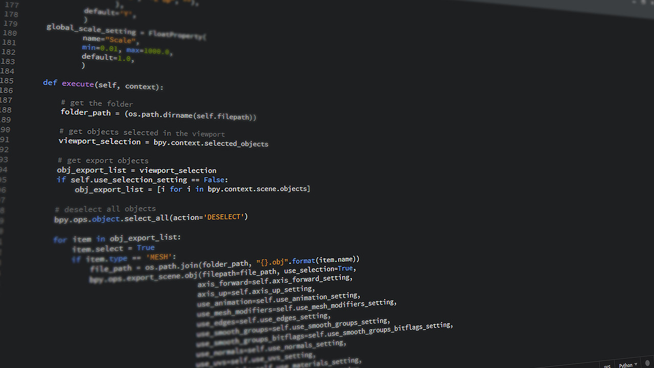
Using Altair to prepare the plot
This post isn’t supposed to be a comprehensive tutorial for Altair or Vega, so it is kept very simple. An example
dataset is loaded and shown as a scatter-plot, however by including the tooltip= keyword additional information
is shown when hovering over nodes. The .interactive() method allows basic panning and zooming, simple but
sufficient as a proof-of-concept.
import altair as alt
from vega_datasets import data

source = data.cars()
source.rename(columns={"Miles_per_Gallon":"Miles per Gallon"}, inplace=True)

chart = alt.Chart(source).mark_circle(size=60).encode(
    x='Horsepower',
    y='Miles per Gallon',
    color='Origin',
    tooltip=['Name', 'Origin', 'Horsepower', 'Miles per Gallon']
).interactive()
Altair’s API feels a little like a hybrid between seaborn and ggplot2, and it will require some getting used to when coming from another library. However, in a few lines of code we have a plot with tooltips and zooming/panning.
Finally, the chart can be written to disk as a JSON file compatible with Vega-Lite. Here,
.properties(width='container') (which doesn’t work inside a Jupyter Notebook) is applied first to make sure
it will occupy the full width of the parent element once included in the website. This makes the plot responsive as
well in one go. Using .save() everything is stored in the specified file.
chart.properties(width='container').save("cars.json")
Including everything in a Jekyll template
Fortunately, the Jekyll template used for this blog already supports adding additional js libraries to specific posts. So after copying all .js files to the correct directory they can be enabled for a specific post by including the few lines below in the header.
custom_js:
  - vega.min
  - vega-lite.min
  - vega-embed.min
  - justcharts
With these libraries loaded a <vegachart> html tag, with the attribute schema-url pointing to the JSON file
made using Altair, can be included in a post. It will magically be converted into a graph, no additonal code required.
Note that the custom style style="width: 100%" is required when the width is set to container in the Vega JSON file.
<vegachart schema-url="{{ site.baseurl }}/assets/posts/2021-05-03-Interactive-Visualizations/cars.json" style="width: 100%"></vegachart>
The result is shown below. A pan-able, zoom-able chart with tooltips showing additional data for each point. A small, but significant improvement over a static image! Vega can do much, much more, so this can be pushed a further still .
Better integration with Markdown
While a few HTML tags in a markdown document in some cases cannot be avoided, there is a way to do this even better.
Using a Jekyll hook, we can create a custom plugin that scans for a pattern as shown below. This is a valid Markdown
syntax of an image, linking to another file. With the hook this is turned into the <vegachart>
tag. This way in case we ever need to use the markdown file in another project, where Vega is not available the page
will render the static image without issue and turn it into a link to the JSON data.
[](/assets/posts/2021-05-03-Interactive-Visualizations/cars2.json)
This custom plugin will detect this and convert it into the required <vegachart> tag. In case there is no plugin
it is perfectly valid Markdown and will show the PNG version of the image, which can be clicked to download the JSON
file.
Jekyll::Hooks.register :posts, :pre_render do |post, payload|
  post.content.gsub!(/^\[!\[(.*)\]\(([^\)]+)\)\]\(([^\)]+)\)/, "<vegachart schema-url=\"{{ site.baseurl }}\\3\" style=\"width: 100%\"></vegachart>")
end
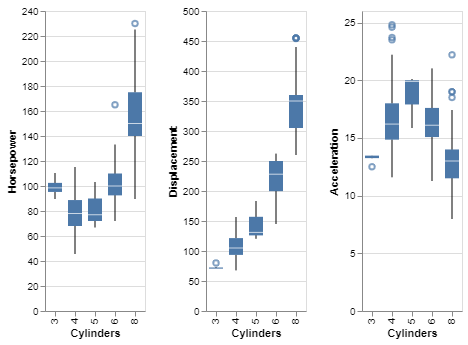
And to show this works, here is the car dataset but shown as box-plots comparing different features based on the number of cylinders. (Okay, I’m lying the previous plot also was included using this syntax)
Conclusion
Your mileage may vary as the creator of justcharts describes his own library as “very hacky” and me adding another layer onto it probably isn’t making it any better. Regardless of the hacky-ness, this provides an extremely elegant way to include interactive plots in a Jekyll template. The workflow as a whole is also smooth as data can be explored as before, with the exception Altair needs to be used instead of seaborn, exported and added with the same amount of code as before. It will take some work to get as proficient with Altair as I’m currently with seaborn, but the advantage of having interactive graphs in my blog is absolutely worth putting in a little effort.
Liked this post ? You can buy me a coffee